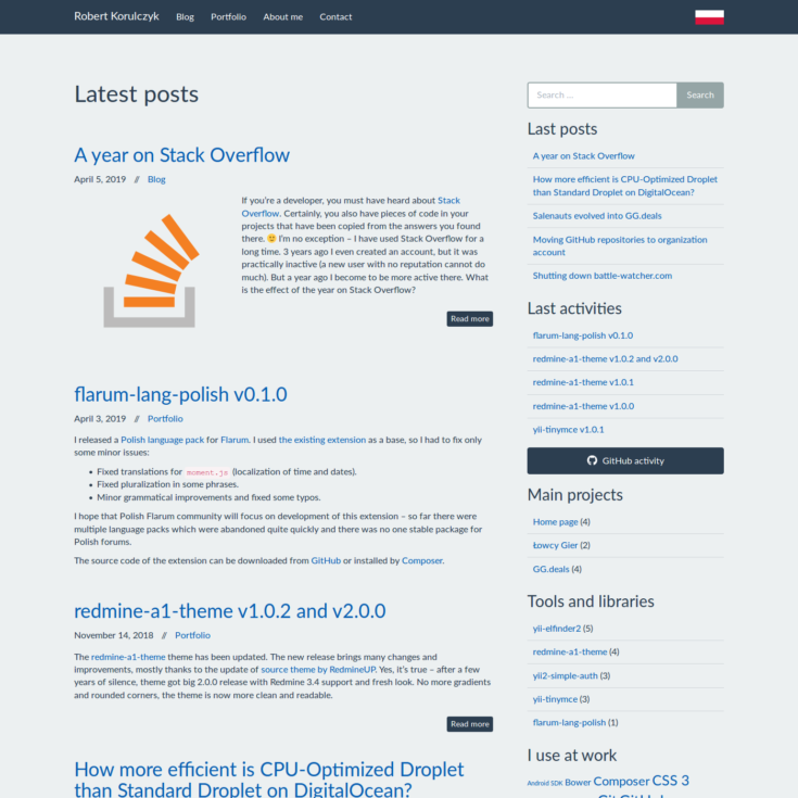
It’s been almost 4 years since I created the current layout of my blog. I finally have some free time, so I decided to refresh it and solve several problems that have been waiting for years. The release of WordPress 5.0 with its new revolutionary editor was another impulse to do this.
Backend
There are not many visual changes, most of the improvements are under the hood. After refactoring the PHP code, practically nothing remained from the default Sage template – I reorganized hooks and classes used in the project. The Composer took care of autoloading. The Composer was also useful for managing dependencies that appeared unexpectedly (we have 2019, now even if you are doing a simple theme for WordPress, you end up with some dependencies 😛).
Thanks to Asset Packagist, Composer also manages the frontend dependencies. 4 years is like a decade for the JavaScript world, in the meantime, Bower has died, and npm finally got lock handling, so each installation does not give you different results. 🙂 However, I’ve chosen Yarn – it is now responsible for managing dependencies used for assets processing. I also updated Gulp and all dependencies – you can see some progress and CSS and JS files have become even smaller.
Frontend
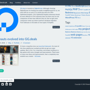
I’ve also changed the most annoying element on the website – buttons for sharing the post no longer load tons of JavaScript from Facebook and other social networks, from now they’re simple static links. I also improved the icons on the website – SVG images replaced the icons served by webfonts and raster flags. Post thumbnails should also better match their format to actual needs.
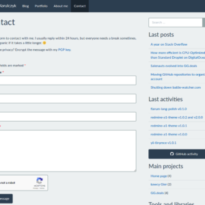
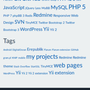
There are also more visible changes – I added some new widgets to the sidebar to separate the regular blog entries from short notes about updates of libraries developed by me. I hope that longer and more interesting posts will be more visible thanks to this – the characteristics of content have changed over the last 4 years and longer posts have been flooded by short portfolio notes. Similarly, I split the widget with a list of projects to larger projects and smaller libraries and tools – also to promote the former. I also added a widget with tags – because, why not? 😀 Taxonomy views now supports description – short descriptions of some tags or tools should be helpful to figure out what it is about. In the end, I added icons in the footer with links to social media services – on most of them there is nothing interesting, but I planned it from the very beginning, so it’s time to finally do it. 🙂
As you can see, there are not many visual changes. Nevertheless, I have improved some technical aspects of the blog, so overall it should work better. Small refactoring and updating coding standards should give it a few more years – I hope that when after the next 4 years I will return to the source code of the theme, it still will be manageable and does not hurt my eyes. 🙂
